Wednesday, 24 April 2013
Sunday, 24 March 2013
4.How did you use media terminologies in the construction and research. planning and evaluation stages.
Media terminology of using the figrig in the production of My Music Video

Media terminology of using the crane in the production of My Music Video


 How to Use PhotoShop This is the test digipack my group created using Photoshop.


How to Use Chromokey This is the video that my group made using Chroma key.

 Then I moved footage around the screen, as shown in the screen-grabs below. The blue box around the picture shows the 'footage' that I am trying to move or resize. The screen-grabs below demonstrate how I moved the picture from top right to bottom left.

 The screengrabs below demonstrate how I used the blue box to make footage larger than its original size. I put my arrow (the mouse) in the corner of the blue box then I dragged the corner further out which made the picture larger.


The figrig is a technology that can be used to film shots of the camera moving in time or following the movements of the characters on screen. I used the figrig so that I could film Grace tidying up the 'living room' set, the figrig allowed me to track her movements by walking slowly and filming her pacing back and forth. In addition, the figrig made it possible to get moving shots such as up and down shots of Grace picking something off the floor.
Media terminology of using the crane in the production of My Music Video

The video camera is at the far end of the crane, the person filming stands at the other end of the crane, where there are two pieces of metal.

To film whilst using the crane (to get moving shots) I had to move the metal handles in opposite directions for example I would have to move one handle upwards and the other downwards. The crane helped to achieve moving shots without a 'shaking' camera or wobbling shots. It made it possible to have smooth panning shots.
Media terminology of using Photoshop in the construction of both advert and digipack.


and my final digipack;

Photoshop was the only application my group used in the production of both my advert and digipack. Even though we used a camera to take the photos, photoshop still proved to be the major contributor to the production of my ancillary. Photoshop was used to download fonts and insert important texts for example album name 'moral panic' and song titles. In addition to creating the template needed for the digipack to look like a real CD cover. Along with having the ability to contrast, brighten and change the quality of the picture.
Media terminology of using Chromokey in construction

How to Use Chromokey This is the video that my group made using Chroma key.
Media terminology of using final cut in the representation of evaluation

I upload a video of me discussing my evaluation aswell as my digipack image, advert and music video on to the final cut. Then I clicked the box at the top of the screen, then options will be displayed and then I clicked on 'image wineframe'.


I used this method on final cut to enable me to have footage of me talking to reveal to the audience that the points I am making are my own points and makes it easier for the audience to understand my view. Having parts of final product for example my advert, lets the audience see the evidence that backs up my point for example I discuss the font of my advert and use final cut to have the advert on screen while I discuss the font. This allows the viewer to see the advert and compare my points as I discuss them, the viewer can see for themselves whether my view of the 'font' is evident in the advert.
Wednesday, 20 March 2013
Thursday, 14 March 2013
Wednesday, 13 March 2013
Monday, 11 March 2013


Tuesday, 5 March 2013
My Group Using the Crane
Me filming with the crane
My group member Grace and Matthew tightening the grip of the crane on the camera.
Monday, 11 February 2013


Sunday, 3 February 2013
Creating the narrative Scenes of my Music Video
This is the location where I filmed my narrative scenes for my music video.(draft 2 and final draft)

This is how me and my group (Matthew and Grace) prepared our location to fit the themes of our narrative. Though we already had the sofa and table, the location still looked empty, it didn't look quite like a home. So we decided to have a green wall (prop) which had a window, to make it look more realistic as an indoor setting. We put a rug into the sitting room and a jug of flowers on the table to make it look comfortable so that it can be easily relatable and recognized as the living room.


This is me, Grace and Matthew filming our narrative scenes.
Saturday, 2 February 2013
Monday, 28 January 2013

Thursday, 24 January 2013
Advertisement Drafts
Draft 2
Draft 2 (alternative)

two drafts for advert by Angel Lilbey on GoAnimate
Video Maker - Powered by GoAnimate.
Thursday, 17 January 2013
Changing narrative for My music video
(The original narratives we had made are below)
Animated Presentations - Powered by GoAnimate.
These are some pictures of how I laid out the props (sofa and table) to see if it could look like an indoor setting. It did do so quite successfully, the sofa helped make the location look like a sitting room.

pictures to gif
Tribal design for Adverisement draft 2
From our feedback we discovered that we needed to connect our background to our artist by having an Aztec style background because the dark blue background was too plain and lacked relevance to our genre.
Searching images on google we came across different Aztec style patterns, we then looked for one that best suited our advertisement. (This is the image below)


Searching images on google we came across different Aztec style patterns, we then looked for one that best suited our advertisement. (This is the image below)
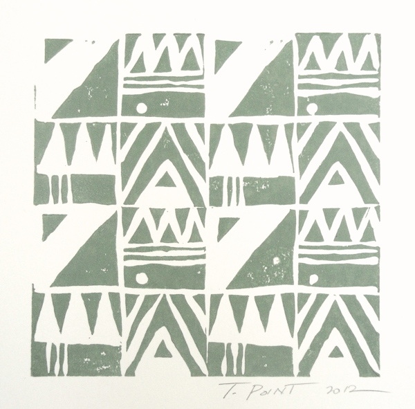
We are not allowed to use it because it is not our idea so we used it to inspire our own drawing, our own Aztec drawing. Which we may use as our background for advertisement.


Our Drawings

Then we experimented with our advert design to see if the tribal designs looked good with our picture.

However, we weren't pleased with it because it looked childish and looked more like a sketch than an actual advertisement.
Monday, 14 January 2013

Wednesday, 19 December 2012
The progress of Adverstisement Draft 1
In this blog post I will talk about the different stages me and my group took in order to produce an our first advertisement draft.
We decided to do a testers before we did the draft to experiment with different shot types and explore
ways to design our advertisement.
These are the pictures that we took during our photo shoot trying to even out the frame so that there would be enough space for writing or displaying promotional website
(Photo shoot tester)

animation maker for free
We took pictures focusing on our artist's face because our advertisement research was focused on making our artist's make up the main attraction.
(advertisement research below)

So we took pictures of Grace's face from different angles and shot types. Then we took pictures where lighting dominated the picture (took more of the frame) to see if it made Grace (artist) look mysterious and worth knowing. Some pictures had different lighting in them in order to create a realistic depiction of our advertisement research where a variety of lights are present in the background and yet Grace still dominates the frame.
However, the fact that Grace doesn't have the makeup design that we had drafted in our research, during these photoshoot testers meant that there is no way that these photos could connect to our genre or our digipack. This is a failure on its behalf, as advertisements need to be able to connect to the product being sold graphically, to make it easier for the product to sell. The product in this case is the digipack. Acknowledging that the advertisement we would end up making using these photos could never become the actual advertisement for our digipack, we decided to try to create an advertisement built on generic conventions to see how professional we could make an advertisement poster.

(watch the throne)

In our case, our artist Pandora (acted out by Grace) is a new artist who has just released her first album meaning that she is a new face to the public, therefore it is important that the audience see her face on the advertisement so they know who she is.
Another flaw is the fact that you could see the background in the image for example the staircase behind the light. Though we tried to edit it as much as we could on Photoshop we couldn't erase it all, so the background makes the picture lack professionalism.
We succeeded in the way we laid out our writing, making sure that what was most important (Pandora, the artist name) was given the biggest font so it would be the main focus. We managed to even out the frame so that the writing didn't overlap important aspects of the photo for example Grace's body and the bright light. The font colour and font size is readable which is another success and slogans for social networking sites have been used to allow the audience to recognize it and perhaps follow or like on these social networking sites. It makes our advertisement look relevant to this decade which focuses so much on social networking as opposed to television to inform one another about music. Including the Young Turks symbol on our advertisement allows our artist to be set aside from other performers, as those familiar with the label would be able to predict the genre she is. Lastly our advertisement was successful in the way it followed the basic requirements of an advertisement which are a promotional track 'hit single' and reviews from well known magazines.
When our painter (the person doing Grace's make up) became available we began to bring our research ideas into life. During the progress of our digipack we made Grace a regular appearance (demonstrated below) which allowed her make up to be the main source of attraction.
Our digipack

So we looked at the other pictures we had taken during the production of our digipack, to find a picture that we could use for our advertisement

After choosing a picture, we maintained the successors of our tester which included the layout of our writing and the words we put in. We fixed the failure of our tester by having a picture where one could see Grace's face, aswell as relating to the original ideas in our research which is having lighting as the background for our advertisement.
(Advertisement Draft 1)

Tuesday, 18 December 2012
Shots deleted during the production of Music Video
The gif below shows ideas of shots that were creative in the way it was framed but it could not be used because it was too dark. This means that you could not see the artists clearly throughout the whole footage and the words the artist lipsynces are hard to see.

animation maker for free
The picture below was an idea we had for a cutaway shot, we wanted the artist to embody the emotions of the song which is pain and anger. However, the artist over presented these feelings so the artist looked depressed. Depression was not the emotions we wanted to present in this music video as it is not the feeling expressed in the lyrics. Nevertheless we considered putting this shot in the music video and we discovered it still looks out of place from other shots. The emotion she expresses through mise-en-scene of her body language and facial expression is too sad for our music video, and the sadness of it makes it difficult to attract our audience. (young people) So we decided not to use it.

Though you can make out her presence and the words she is lipsyncing in the picture below, the shot is too blurry to be included in our music video.

Shots we considered including in our Music Video

We considered including this shot in our music video as it allowed us to do rhythmic editing, a feature of Bordwell and Thompson's theory on creative ways to connect shots. So we took two shots simillar to this one, in the one above she walks away from the camera in the second one she walks towards the camera. We thought that cutting quickly in between these shots would make our music video interesting and it was a creative way to fill in the instrumentals.
We included this shot into our music video because this shot shows our artist clearly and the words she is lipsyncing can be easily recognised. She is in the middle of the frame, there is nothing else in the frame but the artist herself. The casualness of her clothing allows viewers to see past her costume and focus on the artist as the unique aspect of the footage.
This is a typical lipsyncing shot, as it has an extreme close up of the lips to make her lipsyncing more apparent. It is a universal convention for music videos, which is why we chose to include it.

This is a screengrab of one of our performance shots which we chose to include in our music video. This shot enhances our artist by showing our artist's face, body and costume very clearly. The artist dominates the frame by being the only person in the frame, the lighting effectively makes her seem more interesting as it changes colours. The fact that she is laying down with her eyes closed aswell as the light on her face changing helps to give a quirky feel because she looks like she is talking in her sleep which is an act that disconnects from normality.

This shot connects to the "hidden pain and anger' emotions embraced in the lyrics, we acknowledge these as the emotions in the song by annotating the lyrics. As the lyrics said 'let me eat all this lies up' which suggests she is hiding something and 'such a hurricane such a hurting pain' shows that she feels pain and anger. This shot exposes these emotions effectively through mise-en-scene. (her body language)
Making The Digipack Draft 1
The make up for our artist was inspired by Dub Phizix, an alternative dance producer.
 This gif (though sideways) shows the production of the make up, a girl is seen painting the artist to create a simillar design to Dub Phizix's makeup.

create animated gifs
 The location was Dh 27 which is a performance room for Performing Art subjects. We picked this room because of its variety of lighting, it has spotlight with bright white light and spotlights that can change colours. Its main benefit is the black curtains which mean that the background of our images will be black. This conquers one of the problems we had in a previous Dh room where we had to make the room dark to hide the posters preset on the classroom walls.
Below is a slideshow of the different poses we had in our pictures.
We took 250 pictures using HD photography camera, taking atleast 3 pictures of each pose. This gave us a variety of pictures to choose from and meant that if one picture was bad because our artist blinked then the fact that we took 3 pictures of that pose comes in handy as the next picture of our artist in that pose may look perfect.
Here are a few of the pictures we selected.
The location was Dh 27 which is a performance room for Performing Art subjects. We picked this room because of its variety of lighting, it has spotlight with bright white light and spotlights that can change colours. Its main benefit is the black curtains which mean that the background of our images will be black. This conquers one of the problems we had in a previous Dh room where we had to make the room dark to hide the posters preset on the classroom walls.
Below is a slideshow of the different poses we had in our pictures.
We took 250 pictures using HD photography camera, taking atleast 3 pictures of each pose. This gave us a variety of pictures to choose from and meant that if one picture was bad because our artist blinked then the fact that we took 3 pictures of that pose comes in handy as the next picture of our artist in that pose may look perfect.
Here are a few of the pictures we selected.
create animated gifs We then eliminated pictures that we thought would not have any use for our digipack because there is no place to put writting.It is important to have space to put writting as we need to include our artist's name and the album name. After selecting pictures that we thought we could use, we started working on making our digipack cover. Here is the final product.
 This final product of this digipack is considered a draft as it is our first trial of making an actual digipack which relates to our research, the opinions we will gain from peer and teacher assessment will dominate our next moves on our digipack design.

create animated gifs

create animated gifs We then eliminated pictures that we thought would not have any use for our digipack because there is no place to put writting.It is important to have space to put writting as we need to include our artist's name and the album name. After selecting pictures that we thought we could use, we started working on making our digipack cover. Here is the final product.
Subscribe to:
Comments (Atom)