Wednesday, 19 December 2012

The progress of Adverstisement Draft 1

In this blog post I will talk about the different stages me and my group took in order to produce an our first advertisement draft.

We decided to do a testers before we did the draft to experiment with different shot types and explore
 ways to design our advertisement.

These are the pictures that we took during our photo shoot trying to even out the frame so that there would be enough space for writing or displaying promotional website
(Photo shoot tester)
animation maker for free
 We took pictures focusing on our artist's face because our advertisement research was focused on making our artist's make up the main attraction.
 (advertisement research below)

So we took pictures of Grace's face from different angles and shot types. Then we took pictures where lighting dominated the picture (took more of the frame) to see if it made Grace (artist) look mysterious and worth knowing. Some pictures had different lighting in them in order to create a realistic depiction of our advertisement research where a variety of lights are present in the background and yet Grace still dominates the frame.
However, the fact that Grace doesn't have the makeup design that we had drafted in our research, during these photoshoot testers meant that there is no way that these photos could connect to our genre or our digipack. This is a failure on its behalf, as advertisements need to be able to connect to the product being sold graphically, to make it easier for the product to sell. The product in this case is the digipack. Acknowledging that the advertisement we would end up making using these photos could never become the actual advertisement for our digipack, we decided to try to create an advertisement built on generic conventions to see how professional we could make an advertisement poster. 

Nevertheless it did have some failures, for instance the fact that you could not see the artist's face is bad because no one would be able to recognize her as she is not an established artist as this her first album. So how can a costumer seeing this advert then know which Pandora musicians she is. (there are other groups called Pandora) This design would only be ideal if it was for an established artist. for example Jay Z's recent album 'Watch the throne' has not got the faces of the artists on it, neither does it have any pictures of them. The design of the album is creative but doesn't link to who the artists are, this suggests that the ability for this ablum to do well depends on the popoularity of the artists. This album is likely to sell well despite the digipack design as Jay z and Kanye are established successful international artists who have been in the industry for decades.
(watch the throne)

In our case, our artist Pandora (acted out by Grace) is a new artist who has just released her first album meaning that she is a new face to the public, therefore it is important that the audience see her face on the advertisement so they know who she is.
Another flaw is the fact that you could see the background in the image for example the staircase behind the light. Though we tried to edit it as much as we could on Photoshop we couldn't erase it all, so the background makes the picture lack professionalism.

We succeeded in the way we laid out our writing, making sure that what was most important (Pandora, the artist name) was given the biggest font so it would be the main focus. We managed to even out the frame so that the writing didn't overlap important aspects of the photo for example Grace's body and the bright light. The font colour and font size is readable which is another success and  slogans for social networking sites have been used to allow the audience to recognize it and perhaps follow or like on these social networking sites. It makes our advertisement look relevant to this decade which focuses so much on social networking as opposed to television to inform one another about music. Including the Young Turks symbol on our advertisement allows our artist to be set aside from other performers, as those familiar with the label would be able to predict the genre she is. Lastly our advertisement was successful in the way it followed the basic requirements of an advertisement which are a promotional track 'hit single' and reviews from well known magazines.

When our painter (the person doing Grace's make up) became available we began to bring our research ideas into life. During the progress of our digipack we made Grace a regular appearance (demonstrated below) which allowed her make up to be the main source of attraction.
Our digipack

So we looked at the other pictures we had taken during the production of our digipack, to find a picture that we could use for our advertisement
  create animated gifs
After choosing a picture, we maintained the successors of our tester which included the layout of our writing and the words we put in. We fixed the failure of our tester by having a picture where one could see Grace's face, aswell as relating to the original ideas in our research which is having lighting as the background for our advertisement.
(Advertisement Draft 1)

Tuesday, 18 December 2012

Shots deleted during the production of Music Video

The gif below shows ideas of shots that were creative in the way it was framed but it could not be used because it was too dark. This means that you could not see the artists clearly throughout the whole footage and the words the artist lipsynces are hard to see. 
animation maker for free

The picture below was an idea we had for a cutaway shot, we wanted the artist to embody the emotions of the song which is pain and anger.  However, the artist over presented these feelings so the artist looked depressed. Depression was not the emotions we wanted to present in this music video as it is not the feeling expressed in the lyrics. Nevertheless we considered putting this shot in the music video and we discovered it still looks out of place from other shots. The emotion she expresses through mise-en-scene of her body language and facial expression is too sad for our music video, and the sadness of it makes it difficult to attract our audience. (young people) So we decided not to use it. 

Though you can make out her presence and the words she is lipsyncing in the picture below, the shot is too blurry to be included in our music video. 

Shots we considered including in our Music Video


We decided to include this shot in our music video as it was set in one of the locations that we had researched and was included in the storyboard.
The reasons why we later decided to no longer include this shot is due to the fact that it is too normal, it disconnects with the themes of the shots we later took. (particularly those in DH) In other words this shot looked out of place with the other shots in our post production. In addition, too much frame is giving to the location so it makes the shot look as if it was taking from a high angle. We wanted our artist to dominate the frame because she is the most important aspect of the music video.


We considered including this shot in our music video as it allowed us to do rhythmic editing, a feature of Bordwell and Thompson's theory on creative ways to connect shots. So we took two shots simillar to this one, in the one above she walks away from the camera in the second one she walks towards the camera. We thought that cutting quickly in between these shots would make our music video interesting and it was a creative way to fill in the instrumentals.


 We included this shot into our music video because this shot shows our artist clearly and the words she is lipsyncing can be easily recognised. She is in the middle of the frame, there is nothing else in the frame but the artist herself. The casualness of her clothing allows viewers to see past her costume and focus on the artist as the unique aspect of the footage.


This is a typical lipsyncing shot, as it has an extreme close up of the lips to make her lipsyncing more apparent. It is a universal convention for music videos, which is why we chose to include it.

This is a screengrab of one of our performance shots which we chose to include in our music video. This shot enhances our artist by showing our artist's face, body and costume very clearly. The artist dominates the frame by being the only person in the frame, the lighting effectively makes her seem more interesting as it changes colours. The fact that she is laying down with her eyes closed aswell as the light on her face changing helps to give a quirky feel because she looks like she is talking in her sleep which is an act that disconnects from normality. 
 This shot connects to the "hidden pain and anger' emotions embraced in the lyrics, we acknowledge these as the emotions in the song by annotating the lyrics. As the lyrics said 'let me eat all this lies up' which suggests she is hiding something and 'such a hurricane such a hurting pain' shows that she feels pain and anger. This shot exposes these emotions effectively through mise-en-scene. (her body language) 

Making The Digipack Draft 1

The make up for our artist was inspired by Dub Phizix, an alternative dance producer.
This gif (though sideways) shows the production of the make up, a girl is seen painting the artist to create a simillar design to Dub Phizix's makeup.
create animated gifs
The location was Dh 27 which is a performance room for Performing Art subjects. We picked this room because of its variety of lighting, it has spotlight with bright white light and spotlights that can change colours. Its main benefit is the black curtains which mean that the background of our images will be black. This conquers one of the problems we had in a previous Dh room where we had to make the room dark to hide the posters preset on the classroom walls. Below is a slideshow of the different poses we had in our pictures. We took 250 pictures using HD photography camera, taking atleast 3 pictures of each pose. This gave us a variety of pictures to choose from and meant that if one picture was bad because our artist blinked then the fact that we took 3 pictures of that pose comes in handy as the next picture of our artist in that pose may look perfect. Here are a few of the pictures we selected.
  create animated gifs
create animated gifs We then eliminated pictures that we thought would not have any use for our digipack because there is no place to put writting.It is important to have space to put writting as we need to include our artist's name and the album name. After selecting pictures that we thought we could use, we started working on making our digipack cover. Here is the final product.
This final product of this digipack is considered a draft as it is our first trial of making an actual digipack which relates to our research, the opinions we will gain from peer and teacher assessment will dominate our next moves on our digipack design.

Thoughts and discussions present in the making of the production of our music video

This sliderocket shows the thoughts and discussions present in the making of the production of our music video.

Advertisement Draft 1


The Digipack Draft

Front Cover of Digipack

                                                                   Inside of Digipack
*the pink light in the middle continues over the line, like a continuous light streak.

Wednesday, 14 November 2012

Talent Release Form


This is the talent release form signed by Grace who will star in our music video. She has given her permission to star in our music video and will let us know when she is available.

Wednesday, 7 November 2012

Track Permission


For our music video we need to use a track to link and edit our footage with, however, we
 are not musicians neither are we established artists so we don't have our own tracks at our disposal.
This meant that we had to pick a song from an established artist because they are most likely going to have tracks. Our teacher requested that we picked a song where there is no video available so we could create original ideas and not copy the work of the artist. This is why we decided to pick the song 'Right thing to do' by established artist SBTRKT. We picked SBTRKT because he is a British artist on a British label, meaning that he will be easier to contact when requesting track permission. His label is called The Young Turks so we addressed a letter to this record label as opposed to the artist because legally they have rights over the track, whereas SBTRKT is considered a performer, the label is responsible for distribution to the audience.We decided to email a letter to the the record label to have permission to use the track for our media project, asking for permission is important because of copyright laws. If we didn't ask for permission
The Young Turks could legally sue us for missuse of their track. We decided to be honest in our appeal and expose our personal interest with the artists associated with The Young Turks to make it more likely that they reply positively.

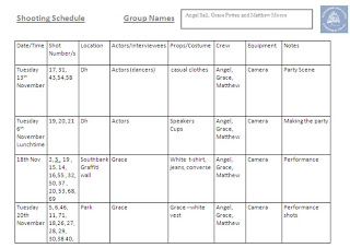
Photoshoot schedule

 Photoshop schedule 

A photoshop plan is vitial as it organises our group by alerting us on days to take photos and reminding us on what to bring for each photoshot aswell as who is in charge of certain aspects of the photoshot.  This way we can be prepared for each photoshot and bring the equiptement needed to take a successful photo. By having a photo shoot plan one can see the different location and their purpose in our work thorugh the columns for instance the urban area is used for the advertisement image whereas the small studio is used for album cover image. By writting the location alongside the image name we can remember why it is vital that we are at location to take photos, as no other location can have the same effect and create the same meanings that the previous location would do. For example only the urban area can be used for advertisement image because of its youthful aspects and trendy colours within graffatic texts, which attractes our target audience. For these reasons we picked the urban area as a perfect location for advertisememt image, meaning that regardless of the weather of the day of the photoshoot we will still film in that location because it is the only location that fits perfectedly with our theme therefore we will not settle for anything else based on preference.

Album Cover Designs - Front and Back

We wanted to make the artist's makeup the most distinctive and important feature of our digipack design therefore we made sure the artist dominated the frame in order to draw the audience to the artist's makeup.Our decision to make the artist's makeup distinctive and quirky was to connect our album cover with the conventions of our genre. (alternative dance) The example below (the image) demonstrates the degree of quirkiness we want to be visible on our artist. This example is the artist Dub Phizix, an alternative dance producer. The use of unisex colours both bright colours (red) and dark colours (black) are used to create a tribal display. This make up looks like the African tribal facial makeup which is used for religious practices or dances. The fact that Dub Phizix uses it to present himself shows how our genre favours distinctive facial makeup. It can be argued that this makeup is not distinctive as this facial makeup design is widely recognised as African and tribal, however, it is distinctive to the western ideology makeup. Which is the idea that makeup is used to beautify an individual as opposed to make them weird enough to stand out.


For our digipack we have made 2 ideal designs
Our 1st design 


Our 2nd design 

Location

Southbank skate park


Street


Nonsuch park
Angels location by Angel Lilbey on GoAnimate

Video Maker - Powered by GoAnimate.

Advert Design


Tuesday, 23 October 2012

Storyboard

This is a storyboard combined with the shot types thought by me, Grace and Matthew.We focused on three different locations we thought were ideal for our music video. Grace drew shot types for the graffiti wall location, Matthew did the street and I did the park. Together we thought of ways to combine our shots together to make a storyboard.  
Below is an animatic showing how we visualise our music video, we included our shots to show how our storyboard will look like if it was brought to live. There are more shots in the animatic than the shots in our storyboard because the shots in our storyboard was based on performance. So as a group we discussed narrative ideas and ideal shots to repeat to make our animatic look like a realistic music video. We followed Brodwell and Thompson's graffic and rhytmic match theory to guide our editing.
  

Sunday, 7 October 2012

8. Concept

Here are some concept ideas that I came up with individually Concept After making these suggestions, I later discussed with my group on a agreed concept for our Music Video. Below is a video demonstrating the concept ideas we made during our discussion.
Here is our concept mind map


1. Initial Ideas